By Paul MacRae, March 15, 2022
Weatherstats.ca is a website that offers data on weather conditions in Canadian cities now and over time since 1913. The site draws its data from Environment and Climate Change Canada and so should be fairly reliable.
Astonishingly, as economist Ross McKitrick pointed out in a 2019 Vancouver Sun article 1, the site shows that for more than a century the average temperatures for most Canadian cities have been pretty much flat. Yes, flat.

If you are looking for the IPCC’s “hockey stick,” which is flat for centuries with massive temperature zooms in recent times (Figure 1), you won’t find it in the Canadian city data, or in the data for most of the world’s cities.
Fortunately, as with Woodfortrees (see article on the Background page), you can check the data for yourself on this website. Here’s how.

Go to weatherstats.ca. You’ll be presented with a map of Canada (see Figure 2); the circled numbers represent Canadian cities and towns. Click on the circle with the city you want (zooming in will reveal more cities in any given area).
Let’s select Victoria, B.C., as an example since this city is a hotbed of climate-alarmist activism. You will get the page shown in Figure 3.

What we want is the historical weather data for Victoria, so click on “Charts” on the top menu of the webpage. You’ll get the page shown in Figure 4.

One of the “go” options is “Temperature” (fifth choice from the top); this should tell us how drastically Victoria has heated up over the past few decades. So click on “go” under “Annual data Jul1-June30” in the “Temperature” line, which starts and ends the data series in mid-summer. (If you use “Annual data” the 25-year series begins and ends in mid-winter, which makes the green line dip down a bit at the end.) You’ll get Figure 5.

The blue top line shows the average high temperatures for this 25-year-period; the black bottom line is the average low; the green line is the mean of the high and low temperatures. As you can see, for Victoria the green line is pretty much dead flat for 25 years. This flat temperature isn’t what we’d been led to expect by the climate alarmists!
How far back in time does Victoria’s flat-lined temperature go? The website has data going back to summer 1913. You can view dates earlier than 1996 in 25-year blocks by clicking on the “Time Warp” button at the top right of the heading (see Figure 3), then changing the number in the “Years:” box (see Figure 6). The box has an up-down arrow to take you back one year at a time, but you can also input a number to go back that number of years (I put in “25” but only the “5” shows for some reason).

Figure 7 shows the average Victoria temperatures from 1971 to 1996. Once again, we have dead flat.

If we go back “50” years, to 1946-1971, we get Figure 8. Maybe the warming started then. But nope; still flat.

Let’s type in “75” to go back another 25 years (1921-1946), as shown in Figure 9. Flat.

And Figure 10 shows the profile from 1913, the farthest back the site goes, to 1938 (I used the “down” arrow under “Year” to go back from “1921” to “1913”). Once again, virtually dead flat.

Winnipeg temperatures also flat
In all fairness, Victoria has a pretty mild climate, with almost no winter to speak of. Maybe it’s not a fair sample of the Weatherstats data, so let’s try Winnipeg, which has hot summers and cold winters (really cold! I know this from years of living there). Figure 11 shows the Winnipeg data from 1996-2021. Flat—as flat as the surrounding prairie.

Let’s go back to 1971-1996 (Figure 12). Flat.

And so it goes for Winnipeg back to 1913: flat mean temperatures. No great ups and downs, and certainly no up-jutting “hockey stick” blade in the last few decades, although a “hockey stick” blade is what we would expect to see if we accept the global-warming alarmist narrative. Try some of the other Canadian cities; you’ll see the same flat-line pattern.
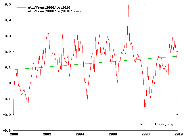
How can this be? One reason is that the temperature graphs we’re usually shown, with dramatic ups and downs, are presented within a narrow range of 1°-2° Celsius (for information on how to create these charts, see the Woodfortrees article elsewhere on the site).

When we zoom out to a temperature range of, say, 100°C (plus-50 to minus-50) in Winnipeg, or to 60°C (plus-40 to minus-20 in Victoria), the green average line flattens out. We no longer see apparently alarming rises and falls in the average temperature (see Figure 13) , and we no longer see dangerous “global warming.” The roughly 1°C of global warming over the past century barely registers at this broader level.
Summing up: There’s no doubt that Canada has been warming, somewhat, over the past century, along with the rest of the world. However, from the broader perspective, average temperatures in Canadian cities are more or less what they were back in 1913 (and probably earlier), before carbon emissions became a scary “thing.” So what, exactly, are we all supposed to be so alarmed about?
- Ross McKitrick, “Reality check — there is no ‘climate emergency’ in Vancouver.” Vancouver Sun, July 23, 2019 ↩
